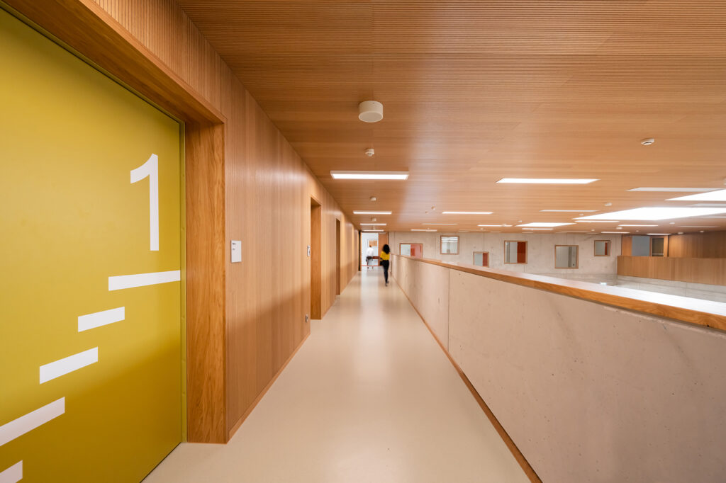
Orientation Through Clear Colors
The Marienschule Oythe has undergone extensive modernization. A design concept for corridors, classrooms, and learning islands strengthens structure, acoustics, and atmosphere. The color concept enhances orientation in everyday school life. Located in the district of…
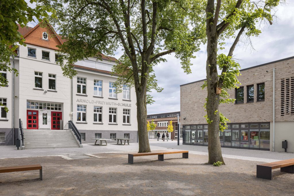
The Marienschule Oythe has undergone extensive modernization. A design concept for corridors, classrooms, and learning islands strengthens structure, acoustics, and atmosphere. The color concept enhances orientation in everyday school life. Located in the district of Vechta in Lower Saxony, the school was comprehensively modernized. A central element of the project was the design of surfaces in corridors, classrooms, and communal areas. Since September 2025, the concept has contributed to the long-term improvement of the learning environment at this primary school with all-day offerings, providing more structure in daily school life for approximately 230 students and their teachers.
The goal of the redesign was to create a friendly and pedagogically high-quality atmosphere
Linus Bocklage
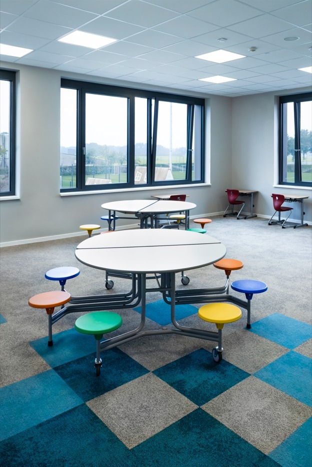
“The goal of the redesign was to create a friendly and pedagogically high-quality atmosphere in which all users feel comfortable,” explains architect Linus Bocklage of B+B Architekten. The concept combines calm base tones with precisely placed color accents as well as modular textile and elastic floor coverings. With the support of the Concept Design Team from Interface, the firm developed a design system that spans three floors and simultaneously functions as a visual guidance system.
Colors as signposts within the spatial structure
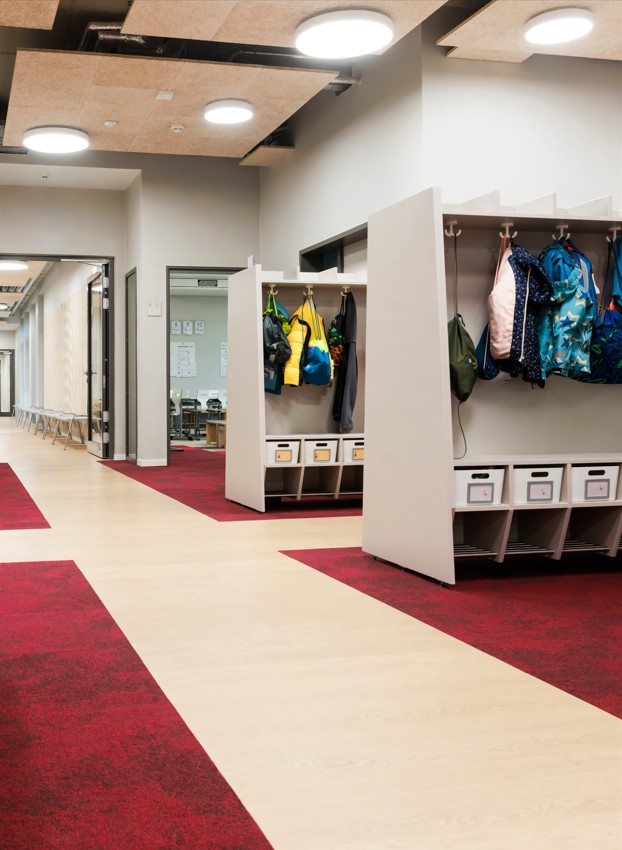
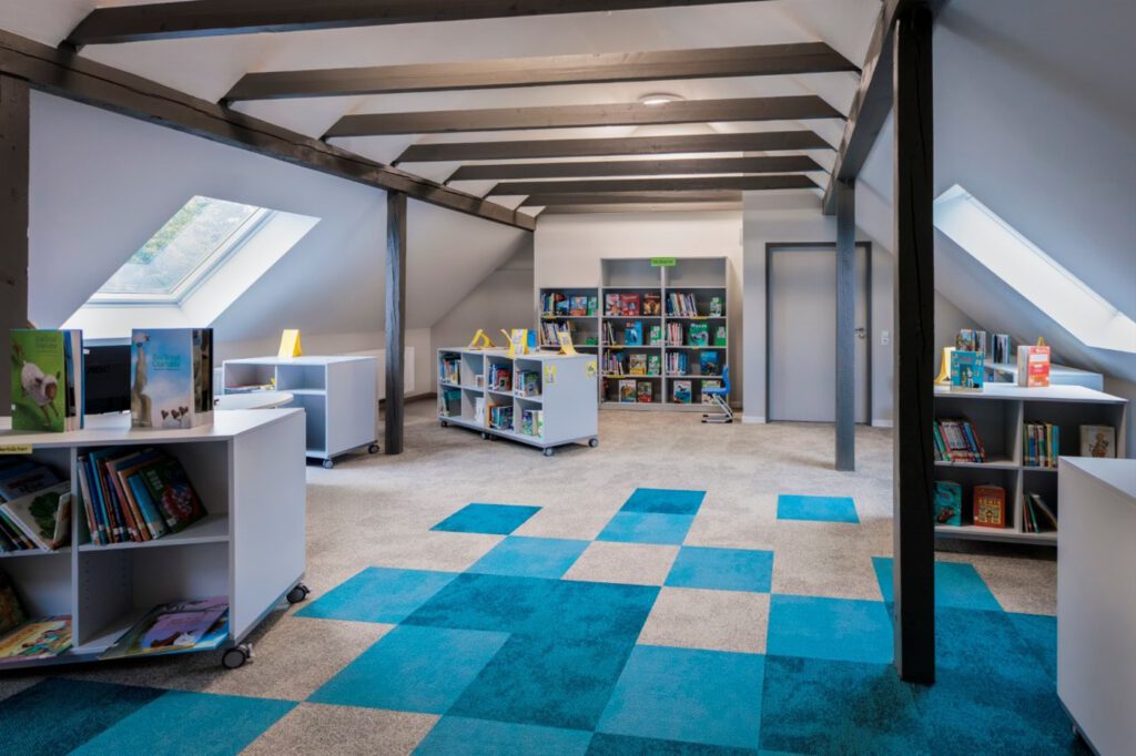
Color markings play a central role, intuitively providing direction for learners, teachers, and visitors. Each grade level was assigned its own color scheme. The colors red, yellow, green, and blue structure corridors, transitions, and learning islands. Carpet tiles from the Composure collection are concentrated in front of the classrooms, then dissolve into lighter tones and finally transition into a calm base tone. Common areas and the library are designed in turquoise.
The accent colors were each installed in a light and a darker tone. Tiles in a 50 × 50 cm format create a slightly pixelated structure and a harmonious overall appearance. In the music room, slender planks from the On Line collection pick up the motif of piano keys.
Less noise, more concentration
Good acoustics play a central role in school buildings. Carpet tiles significantly improve room acoustics here, achieving an impact sound reduction of 23 dB. Muffled footsteps also ensure a quieter atmosphere in the corridors. The LVT design used there further reduces impact sound. A special feature of the school also contributes to the concentrated learning atmosphere: students move through the building exclusively in non-slip socks or slippers. Outdoor shoes remain in the entrance area. “We are now much better able to combine quiet learning phases with communicative elements,” says headmistress Annika Bosse.
We are now much better able to combine quiet learning phases with communicative elements
Annika Bosse
In addition to the acoustic effect, the design also meets high requirements for durability and maintenance. A confetti-like LVT pattern was installed in workshop and art rooms, which conceals minor dirt while remaining resilient. The surface reduces scratches and is easy to clean.


You might also be interested in
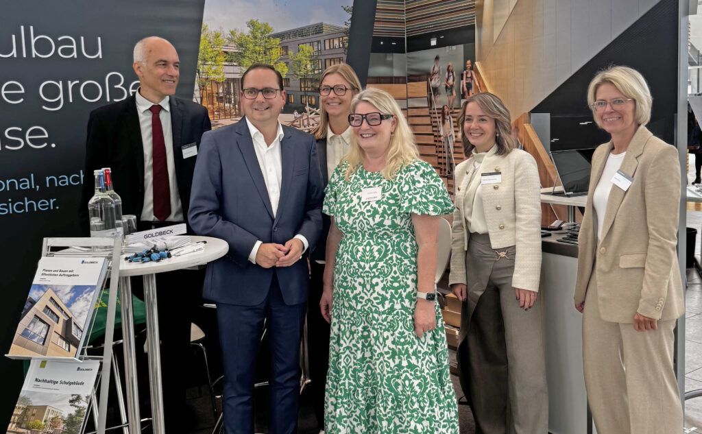
SCHULBAU Fair
SCHULBAU Essen 2025 – Successful industry meeting for educational construction
Architecture, SCHULBAU Fair
Gustav Heinemann Comprehensive School Essen: How architecture accompanies change in the neighbourhood